The Ultimate CSS Flexbox Layout Guide (With Examples)
Hey there, Today we are going to discuss the very important topic for Responsive Web Designs that is CSS flexbox layout with detailed examples.
By the end of this CSS flexbox tutorial, you will be able to use it easily.
Why CSS flexbox layout is important?
CSS Flexbox layout which is officially known as Flexible Box Layout Module is very useful to build responsive websites.
This flexible layout system will help us to design responsive website for all devices with simple and easy CSS flexbox properties.
You must read about CSS media query to understand the responsive web design more deeply.
That’s why we have designed this CSS flexbox tutorial where you can find all the important and useful flexbox properties with examples.
Is it hard to learn CSS flexbox layout?
No, not at all, just stay tuned with us.
As its name suggest flexbox, means flexible box. Which can align their items horizontally or vertically.
Even can expand or shrink in size (height and width) to cover the free space or to prevent overflow.
With this characteristic’s CSS flexbox can help us to design very responsive websites for all kind of devices.
CSS Flexbox is a single dimensional layout model.
What’s Single dimensional layout model?
Single dimensional means one direction at a time either row or column.
Because of this limitation, it used for small scale websites or block sections of websites. Whereas CSS grids used for large websites.
What about browser support of CSS flexbox layout?
Yeah! Good question.
Because it comes many years ago, it is supported by all major browsers. More on browser support information is available at caniuse.com.
One more resource to check the browser compatibility is MDN browser support chart.
How to use CSS flexbox ?
Basically, there are two kind of flex elements,
- CSS Flex container (parent element)
- CSS Flex items (child elements)

Because, Flex layout model is a collection of CSS properties. So, there are two kind of properties for two flex elements.
- Flex container properties
- Flex items properties
CSS flexbox properties
Flex container properties
| 1. | display | flexbox | inline-flex |
| 2. | flex-direction | row | row-reverse | column | column-reverse |
| 3. | flex-wrap | nowrap | wrap | wrap-reverse |
| 4. | flex-flow | <flex-direction> | <flex-wrap> |
| 5. | Justify-content | flex-start | flex-end | center | space-between | space-around |
| 6. | align-items | flex-start | flex-end | center | baseline | stretch |
| 7. | align-content | flex-start | flex-end | center | space-between | space-around | stretch |
Flex items properties
| 1. | order | <integer> |
| 2. | flex-grow | <number> |
| 3. | flex-shrink | <number> |
| 4. | flex-basis | <length> | auto |
| 5. | flex | none | <flex-grow> | <flex-shrink> | <flex-basis> |
| 6. | align-self | auto | flex-start | flex-end | center | baseline | stretch |
Ok, let’s get started,
Flexbox container
First thing that you have to do is just create a flex container element, like below,
.flex-container {
  display: flex;
}
We can use display: flex if want to use container at block level. It means flex container will cover the full width and it will not allow another element to take place next to it.
Another thing is inline-level element which allows other elements to take place next to it. Here we can set display: inline-flex.
After creating flex container, it will allow us to apply all flex properties to its direct child elements.
To understand more about direct child approach, look at the below graphics.

Here, you can see, blue element is a flex-container with display: flex. Orange elements are flex-items because these are direct child elements of flex-container (blue).
But purple elements are not direct child of blue element (flex-container) that’s why purple elements behave as per their own property (block or inline).
CSS flexbox direction:
First of all, I want discuss flex-direction which is very important to understand before other flex properties.
As we have discussed that each flex element can use one direction at a time (single dimensional) either row or column.
So, flex-direction can have following possible values,
- row
- row-reverse
- column
- column-reverse
For example, if parent element has flex-direction: row then it’s child elements will be horizontally aligned.
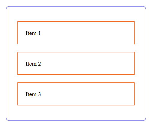
And if the parent element has flex-direction: column then it’s child elements will be vertically aligned.
.flex-container {
   display: flex;
   flex-direction: row;
}

.flex-container {
   display: flex;
   flex-direction: column;
}
CSS flexbox wrap:
Flex-wrap can help us to handle the overflow of flex-items. We can manage flex-items in a single line or multiple lines with the help of flex-wrap.
The default value of flex-wrap is nowrap, it means by default flex-items will align in a single row.

But we have another value for flex-wrap which is wrap. It allows flex-items to shift to the next row if needed according to the device or window size.
.flex-container {
  display: flex;
  flex-wrap: wrap;
}

Ok, even we have wrap-reverse that will shift overflowed row to the top
.flex-container {
  display: flex;
  flex-wrap: wrap-reverse;
}

Flex-flow:
We have another interesting flex container property that is flex-flow.
Basically, it combines both flex-direction and flex-wrap to create a shorthand property flex-flow: <flex-direction> <flex-wrap>.
.flex-container {
  display: flex;
  flex-flow: row wrap;
}
Justify-content:
CSS flexbox justify-content is used to align the flex-items with the following possible values.
- flex-start
- flex-end
- center
- space-between
- space-around
But here, one question must encounter us that is which direction will be used by justify-content to align flex-items. Like
If flex-direction is row:
Justify-content will align items from left to right with the help of flex-start value and right to left with flex-end.
It will horizontally center the flex-items by using justify-content: center. It means, everything will work horizontally.
Flex-start
.flex-container {
    display: flex;
    flex-direction: row;
    justify-content: flex-start;
}

Flex-end
.flex-container {
    display: flex;
    flex-direction: row;
    justify-content: flex-end;
}

Center
.flex-container {
    display: flex;
    flex-direction: row;
    justify-content: center;
}

Space-between
.flex-container {
    display: flex;
    flex-direction: row;
    justify-content: space-between;
}

Space-around
.flex-container {
    display: flex;
    flex-direction: row;
    justify-content: space-around;
}

If flex-direction is column:
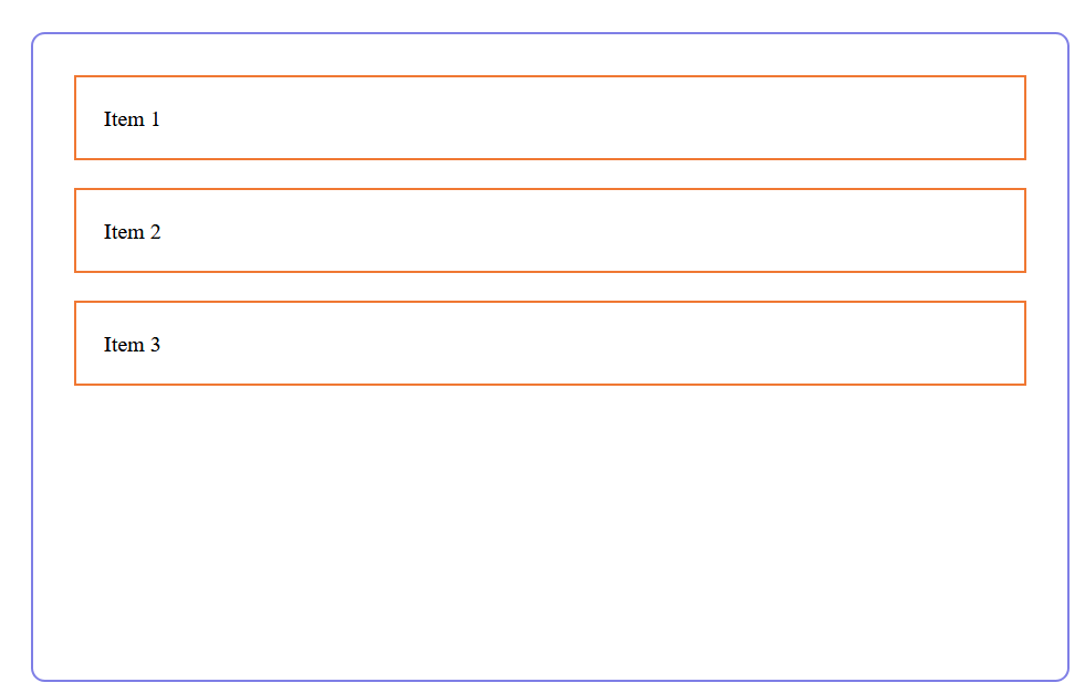
Now, justify-content will align flex-items vertically from top to bottom. Like flex-start means top and flex-end means bottom.
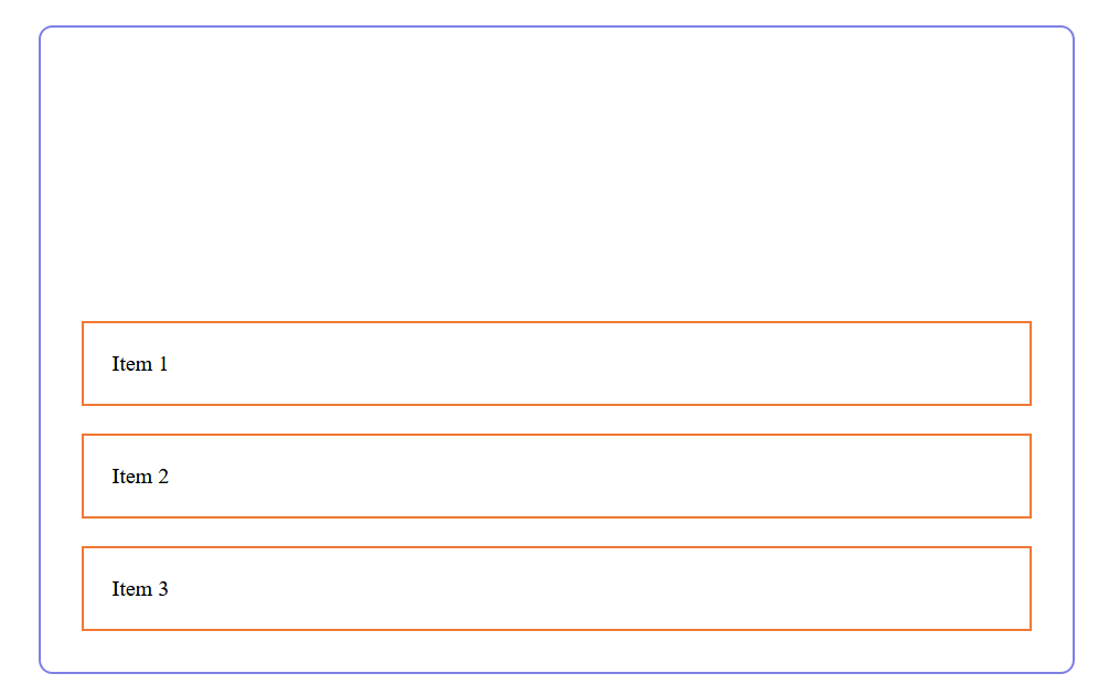
Even justify-content: center will center the flex-items vertically.
Flex-start
.flex-container {
    display: flex;
    flex-direction: column;
    justify-content: flex-start;
}
Flex-end
.flex-container {
    display: flex;
    flex-direction: column;
    justify-content: flex-end;
}
Center
.flex-container {
    display: flex;
    flex-direction: column;
    justify-content: center;
}
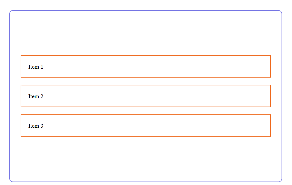
I hope you get the picture of justify-content in both context row and column flex-direction.
Align-items:
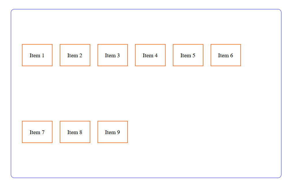
CSS flexbox Align-items will also work as justify-content to align flex-items but in opposite direction. Like if flex-direction is row then align-items will work vertically and if flex-direction is set to column then align-items will work horizontally.
Align-items have following possible values,
- flex-start
- flex-end
- center
- baseline
- stretch
Example align-items center
.flex-container {
    display: flex;
    flex-direction: column;
    align-items: center;
}
Align-content:
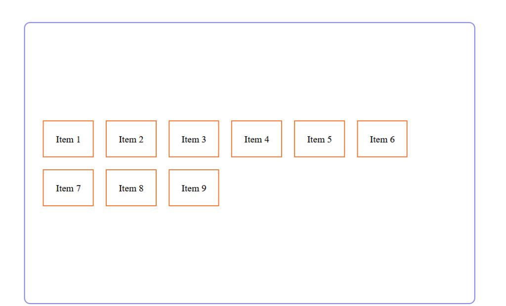
Align-content will align flex line in the same direction as align-items. Like if flex-direction is row then it will align flex-line to vertically and if flex-direction is column then it will align flex-line to horizontally.
Align-content have following possible values,
- flex-start
- flex-end
- center
- baseline
- space-around
- space-between
- space-evenly
- stretch
.flex-container {
    display: flex;
    flex-direction: column;
    align-content: center;
}
How to use CSS Flex-Items ?
To use flex-item we don’t need to do anything special or different than flex-container because when we defined the parent element as a flex container then its direct child elements will automatically become flex-items.
Now, we have some properties to use with flex-items.
Order
Guess what?
As its name suggest, CSS flexbox order can change the sequence of flex-items with different order. Like below
<div class="d-flex container">
       <div style="order: 3;" class="item">
            Item 1
       </div>
       <div style="order: 6;" class="item">
            Item 2
       </div>
       <div style="order: 4;" class="item">
            Item 3
       </div>
       <div style="order: 5;" class="item">
            Item 4
       </div>
       <div style="order: 1;" class="item">
            Item 5
       </div>
       <div style="order: 2;" class="item">
            Item 6
       </div>
    </div>

So, with the help of order property we can change the layout without actually change the order of elements.
Flex-grow
Flex-grow basically use the available space of flex-container to expand the flex-item.


As you can see the difference between two examples where green boxed flex-item shows the flex-grow effect.
Flex-shrink
It’s basically used to ensure that how much a flex-item can shrink if there is not enough space available in the flex-container. Default value is 1 and value must be a number.
Flex-basis
Actually, flex-basis define the default size of flex-item before distributing available space of flex-container.
We can specify the width of the element like below,
flex-basis: 144px | 12em | auto;
or can use keywords
flex-basis: fill | max-content | min-content | fit-content | content;
Flex
Flex is basically a shorthand property. It covers flex-grow, flex-shrink, and flex-basis. Like below in the example
Flex: 0 0 100px;
It is good practice to use this shorthand instead of full syntaxes. Flex-shrink and flex-basis are two optional parameters.
Default is
Flex: 0 1 auto;
Align-self
Now it’s time to align flex-items by themselves. So, we have align-self property which is flex-item based property.
align-self: auto | flex-start | flex-end | center | baseline | stretch;
With the help of this CSS property we can align individual flex-item.
Made with CSS flexbox
We have found some interesting web games made with CSS flexbox or made to practice CSS flexbox layout.
If you like the effort, please comment and share it with your friends.





1 thought on “The Ultimate CSS Flexbox Layout Guide (With Examples)”