CSS Grid Layout Tutorial (A Comprehensive Guide)
So, what’s up dude! We have come again with a new master class that is CSS grid layout tutorial.
Here, we will guide you to use CSS grid for responsive web designs. So, stay with us for the next 7 minutes.
What is CSS Grid Layout?
First of all, the grid means 2-dimensional layout which can handle both rows and columns simultaneously. So, CSS grid layout is two-dimensional layout whereas flexbox used single-dimensional layout.
By the way, we have published a complete guide about CSS flexbox layout, here.
Browser support of CSS Grid Layout
You can read about browser support on caniuse.com, it provides the browser support information like below,
Basic terminology
OK, let’s understand some basic terminology of CSS grids. These terms are very common and going to be used again and again during this CSS grids tutorial.
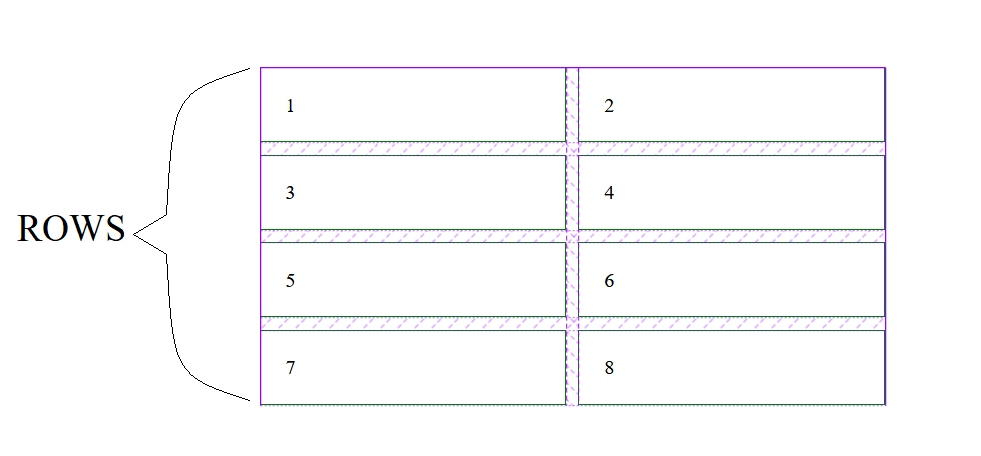
Grid rows
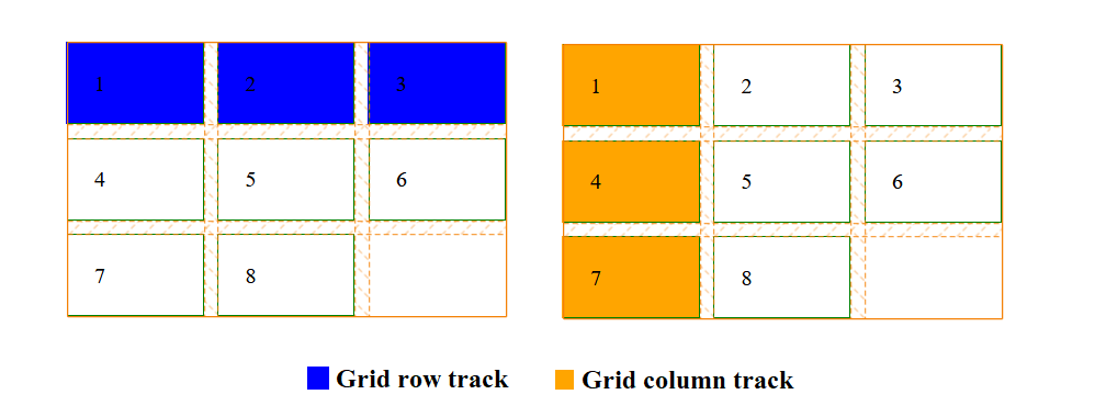
CSS grid rows are the same as in the table or spreadsheet if you are familiar with that. Basically, rows are the horizontal lines in the grid, left-to-right.
Grid columns
CSS grid columns are the vertical lines in the grid, top-to-bottom. As in the below example, vertical lines are grid columns.
Grid gap or gutters
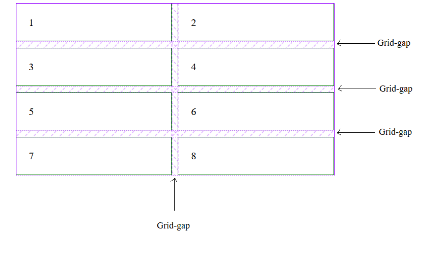
With CSS grid, most of the time we want some space between rows and columns to manage the clean look of the layout. It is known as grid-gap or gutter.
.container {
    display: grid;
    grid-template-columns: 1fr 1fr;
    grid-gap: 10px;
}
Grid lines
CSS grid lines are those lines who draw the basic layout of the page. Like, row lines which draws horizontally between the grid rows and column lines which draws vertically between grid columns.
Grid cell
CSS grid cell is a basic block of grid. We can understand it as a single unit of grid. Like rows and columns joint together to create a cell and collection of cells is known as grid.
Grid areas
CSS grid area is a collection of one or more than one cell. We will basically use grid area to define the portion of one template like header, sidebar, footer etc. We will understand it in detail later.
Grid tracks
CSS grid tracks are simply rows and columns. Like total cells of one column is a single track and total cells of one row is also a track. We will use tracks to define the width and height of rows and columns.
The unit fr
The fr is a fractional unit which means a flexible unit. It is basically used in CSS grids. Actually, fr uses the part of available space, like if there are three columns with 1fr unit then all three columns will take equal space out of available free space.
.grid {
            display: grid;
            grid-gap: 10px;
            grid-template-columns: 1fr 2fr;
        }

Let’s assume about the grid which is 500px wide and 10px of grid-gap or gutter. So, we have 490px for width. As we have defined the grid-template-columns 1fr+2fr = 3fr. Now divide the 490px into 3 parts.
Now 1fr = 163.333px because 163.333 X 3 = 490 that’s it. It means 2fr = 326.667px.
Hope you got the idea about the fr unit.
The implicit and explicit grid
When we define the CSS grid rows and columns via grid-template-column and grid-template-rows, it is known as the explicit grid.
So, what is implicit grid?
Let’s understand with the following example,
.grid-container {
            display: grid;
            grid-gap: 10px;
            grid-template-columns: 1fr 1fr;
            grid-template-rows: 1fr 2fr;
   }

  .item {
      border: 1px solid #008000;
      padding: 20px;
 }
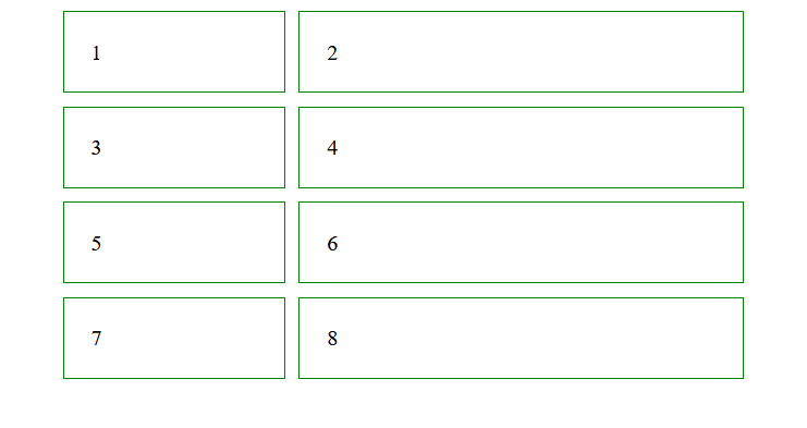
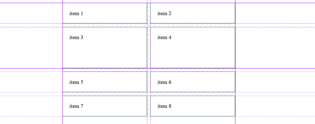
Here, we have defined eight grid items where we have used two columns with grid-template-column and two rows with grid-template-rows. Other than this we have two more rows which are automatically created because of extra grid items. These are called the implicit grid.
Implicit grid items take the size according to their content, means these are auto-sized.
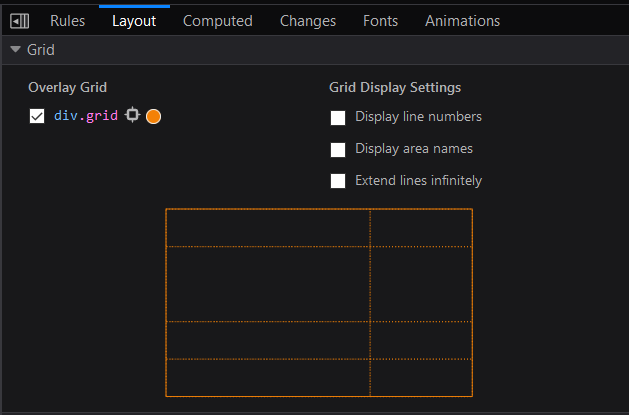
Mozilla Firefox grid inspector
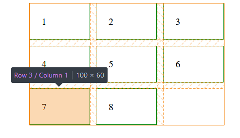
Firefox grid inspector is a very useful tool to work with CSS grids because here we can inspect all aspect of the grid with visuals like grid lines, line numbers, area names etc.
There are two main HTML elements used to work with CSS grid, grid container element (parent) and grid item element (child).
Grid Container or parent element
It is a wrapper element which wrap its items into a single box. To create a container element, we need to defined the property display to grid.
.container {
    display: grid;
}
Note: A column controls the width of the cell and A row controls the height of the cell.
Grid Items or child elements
Grid items are direct child of grid container not nested children, only direct children element. When we defined an element with display grid, it becomes a grid container and its direct child immediately become grid items.
.container {
    display: grid;
}
.item {
    padding: 20px;
    border: 1px solid;
}
<div class="container">
    <div class="item">item 1</div>
    <div class="item">item 2</div>
    <div class="item">item 3</div>
    <div class="item">item 4</div>
</div>
CSS Grid container properties
The first property of CSS grid container is a display property that convert an element into the grid container. We can use grid or inline-grid for display property.
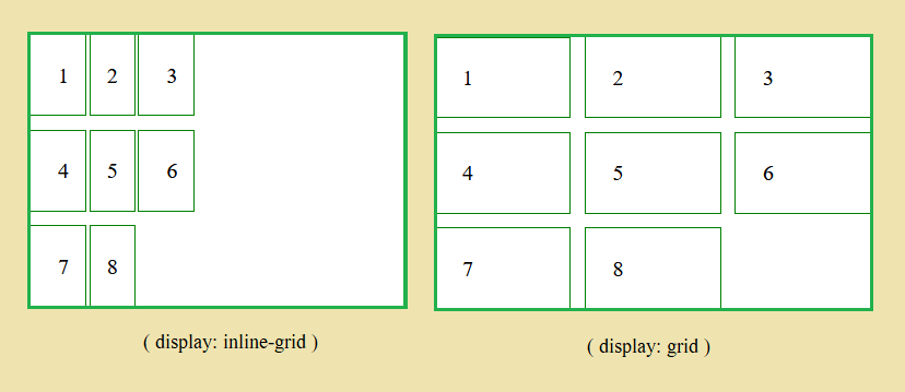
Grid vs inline-grid
CSS Grid is a block-level element and inline-grid is an inline-level element, which allows other elements to take place next to it.
The grid-template-columns
This property defines the number of columns in the grid. With the help of grid-template-columns, we defined the width of the columns. For example,
.container {
     display: grid;
     grid-template-columns: 1fr 2fr;
}
As we can see in the above example, the space-separated list of values is used to define the number of columns and the width of each column.
Here we can use any kind of CSS unit like %, rem, em, px, etc. to define the value of this property. Even we can use the fr unit which is enough flexible to adapt the window size or device size.
The grid-template-rows
The grid-template-rows defines the number of rows in the grid. Here we use this property to define the height of the rows and a total number of rows. For example,
.container {
     display: grid;
     grid-template-rows: 1fr 2fr;
}
The above example shows the space-separated list of values. These values are used to defined the number of rows and height of individual row.
We can use fr unit, auto, %, rem, em, px, etc. to define the height of each row.
The repeat () function
This function can help us to define the grid-template-columns when all columns need to be same width. Same way, we can also use this function for grid-template-rows when all rows need to be same height.
To understand it more clearly, let’s jump over the example,
.container{
            display: grid;
            grid-template-columns: repeat(3, 1fr);
            grid-template-rows: repeat(2, 1fr);
 }
In this example we have defined the 3 columns with width 1fr and 2 rows with height 1fr.
The justify-content property
Justify-content is used to align the grid items, as per available space inside the grid container.
justify-content: start | end | center | space-around | space-evenly | space-between
The align-content property
Align-content property is used to align the all grid items vertically inside the grid container. Following are the possible values of align-content property,
- Center
- End
- Start
- Space-evenly
- Space-around
- Space-between
align-content: start | end | center | space-around | space-evenly | space-between
CSS grid items properties
As we have discussed, grid items are direct child elements of the grid container. By default, it creates a single column and single or multiple rows as per the total number of grid items.
The grid-column property
As we know this is grid-item based property. So, we can use it to place the item in the single or multiple columns.
The grid-column property is a shorthand property of grid-column-start and grid-column-end.
For example,
.item1 {
      grid-column: 1/4;
 }
.item1 {
      grid-column: 1/ span 4;
 }
As the above example, we have defined the start column line and end column line to place the item.
The grid-row property
It is a shorthand property of grid-row-start and grid-row-end. It also behaves as grid-column does. The grid-row property is used to place the item inside the row. For example,
.item2 {
   grid-row: 1/ 4;
}
.item2 {
    grid-row: 1/ span 4;
}
Here we have defined the start row line and end row line to place the item.
The grid-area property or naming grid items
When we use grid-row and grid-column property together it becomes a grid-area. So, grid-area is also a shorthand property for grid-row and grid-column property.
The grid-template-areas
This property is used to placing the grid items as per their area name inside the grid layout.
.grid {
            display: grid;
            grid-template-rows: 1fr 0.5fr 2fr 1fr;
            grid-template-areas: 'header header'
                                'navbar navbar'
                                'sidebar content'
                                'sidebar content'
                                'footer footer';
        }
        .item {
            border: 1px solid #008000;
            padding: 20px;
        }

        .item1 {
            grid-area: header;
        }
        .item2 {
            grid-area: navbar;
        }
        .item3 {
            grid-area: content;
        }
        .item4 {
            grid-area: sidebar;
        }
        .item5 {
            grid-area: footer;
        }
<div class="grid">
            <div class="item item1"> item 1</div>
            <div class="item item2"> item 2</div>
            <div class="item item3"> item 3</div>
            <div class="item item4"> item 4</div>
            <div class="item item5"> item 5</div>
 </div>
If you like this CSS grids tutorial, please share it with your friends.
We have found some interesting learning material on the web, So you can check-out that also.
- Grid garden (a grid game)
- CSS grid (free course)
- Scrimba CSS grid (free course)
- Grid generator (web app)
If you have understood the basics of CSS grid layout then this is for you a detailed and complete CSS grid layout guide by CSS-tricks.
